Building a Great Customer Experience
into Website Design
When updating your website, it's important to begin with a clear understanding of your desired outcome. Having a well-defined goal will then guide each decision that follows.
For example, ask yourself what you expect your visitors to do while visiting your site. Then consider how you can make it as easy and intuitive as possible for them to do so.
In most cases, �the ultimate goal is converting a visitor into a paying customer. Given that, how will your web design seamlessly guide visitors through a consideration path that will ultimately lead to a purchasing decision?
Engaging the corporate buyer
Engagement is a critical factor in any buying process. The key to engaging CFOs, as reported in our March edition, is objective, fact-based and comprehensive information. But how do you establish a strategy that delivers enough content to satisfy client demand, while keeping the user experience as streamlined and intuitive as possible? Morris Sneor, vice president of website development at digital marketing agency Paradigm Productions, Inc., offers his insights and recommendations below.
Establish behaviors
Visitors are most engaged when they can concentrate their efforts on what they intend to do instead of trying to figure out how to do it. Your website's computer interface should feel natural and align with user expectations.
The most effective way to build this sort of interface for your new website is to review the usage patterns of your current site. Website analytics platforms such as Webtrends, KISSmetrics and Google Analytics can help. To illustrate, let's look at an example from Google Analytics.
With Google Analytics, you can follow the path visitors take from one page to the next using a flow visualization report. In a single graphic, you can see how users enter, engage and exit your content, providing insights into which pages are converting visitors effectively and which are obstacles to conversion. The behavior flow report removes the guesswork from your website's engagement patterns. It allows you to clearly see which pages are supporting and which are hindering conversions. You can then make whatever adjustments are needed to optimize conversions.
Intuitive, user-friendly design
"Website design" is an umbrella term encompassing multiple elements that define a user's holistic experience. Design elements to consider include:
- Navigational structure. Your navigational structure serves as the information architecture. This is where the hierarchy, categorization and labeling of your content is road-mapped. A good navigation framework helps users quickly and easily find what they're looking for. A key component of this is a comprehensive search capability. Forrester Research studies have found that a search capability is one of the most important tools customers look for when visiting a bank website. Yet, according to Forrester, website visitors rate the search tools on most bank websites as inadequate.
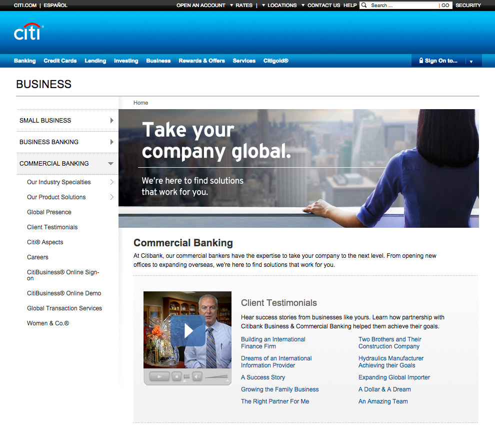
- Page layout. A good homepage layout functions as both the gateway of entry and the primary dashboard of information pathways. As seen in this example from Citi, a good interior page layout features benefit-oriented headlines, sub-headlines, bullet points and plenty of white space. This allows visitors to quickly scan the page to find what they are looking for without having to wade through unnecessary or irrelevant detail.

- Interactive design. Interactive design is all about what happens after a click – what appears on the screen, how it appears and the way it appears.
- Conversion optimization. In order to optimize conversion, you must provide users with a clear path of progression to the next logical step, and end with a clear call to action. Each webpage should contain a prominent call to action. Sales can be lost if prospects need to hunt for contact information or inquiry forms.
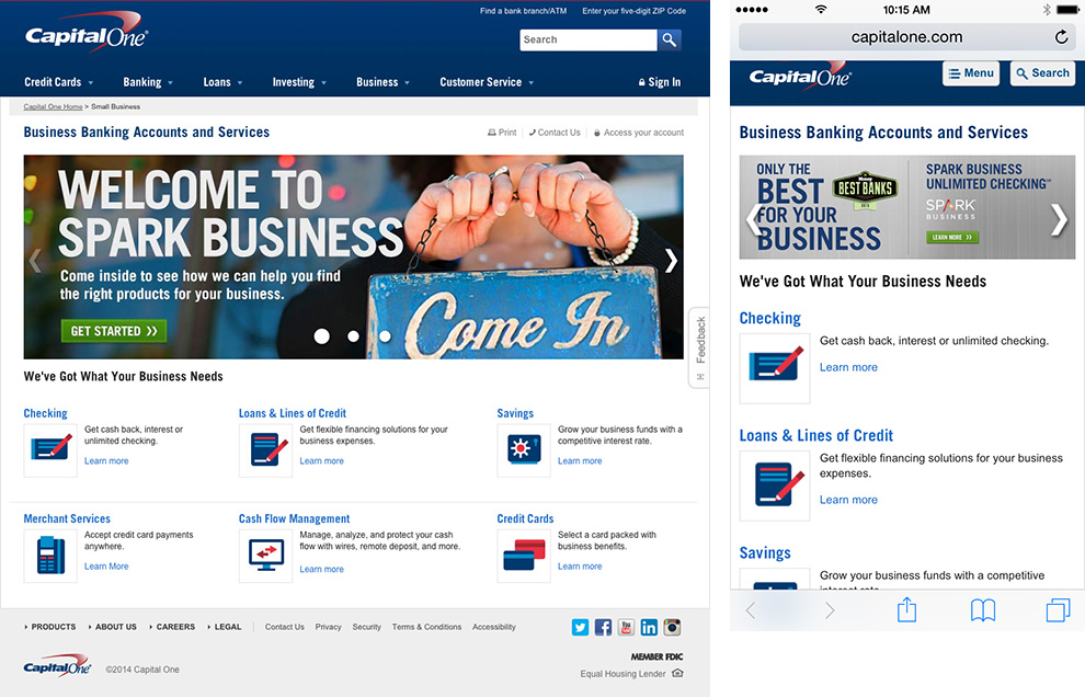
- Responsive design. Customers expect to access information anywhere, anytime and on any device, without compromising the user experience, and with no surprises. Below is an example of a user-friendly layout in which the user has a consistent experience using either a desktop or a smartphone.

Be sure to get feedback on your design from users of a variety of smartphones and tablets.
- Search Engine Optimization. SEO makes it easier to index your website pages to take advantage of prospects doing keyword searches for financial products and services on Google or other popular search engines. SEO services identify the most common keywords on the Internet for your category and the organic keywords used to find your website, including keywords entered by visitors when searching your site. You can triangulate findings from this analysis to determine final keyword phrase selections. Companies with mobile versions of their websites are also rewarded by search engines with higher rankings than those without mobile sites.
- Testing. No doubt your IT is the primary enabler of your website's functionality. However, great websites apply input from cross-functional and multidisciplinary teams of customer-facing bankers who are more in tune with corporate end users. Getting feedback on ease of usability from such groups in advance of launching your site can prevent costly and time-consuming website adjustments after the fact.
With advanced consideration of these key elements throughout the design and development process, you'll be better positioned to reinforce your corporate brand, increase conversions and promote repeat usage of your site.
Established in 1995, Paradigm Productions, Inc. is a full service agency offering leading-edge creative, strategic and technological expertise designed to assist corporations worldwide maximize sales and marketing opportunities in the evolving digital space. For more information or a free website assessment, call 888-737-0018 or contact [email protected].
|


 Follow us on Linkedin